New Route Schedule design
Click here for a full preview of a new schedule.
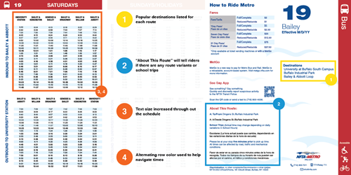
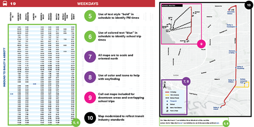
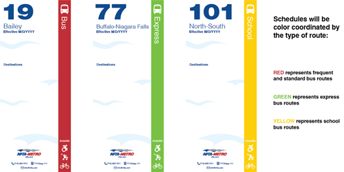
Click on images below to get a breakdown of the changes color coded with the key updates.
This is a list of the 10 Key Changes in the above graphics.
1. Popular destinations listed for each route.
2. About this Route will tell riders if there are any route variants.
3. Increased text size throughout the schedule.
4. Alternating row color used to help navigate times.
5. Use of Bold Text style in schedule to identify PM times.
6. Use of colored text "blue" in schedule to identify school trip times.
7. All maps are to scale and oriented north.
8. Use of color and icons to help with wayfinding.
9. Call out maps included of downtown areas and overlapping school trips.
10. Map modernized to reflect transit industry standards.
Why is NFTA doing this?
First and foremost, because you asked us to. We’ve received feedback about our schedules needing improvement and we spent time and resources researching the best ways to improve them. We talked with riders, employees, and advocates about what could be better.


